Featured project · 01
momondo, 2025
Hvor' du fra?
I helped turn an established campaign idea into a coherent visual world, collaborating on the identity while owning key physical and digital touchpoints from design through production.
01 / Role & outcome
One campaign, built across every touchpoint.
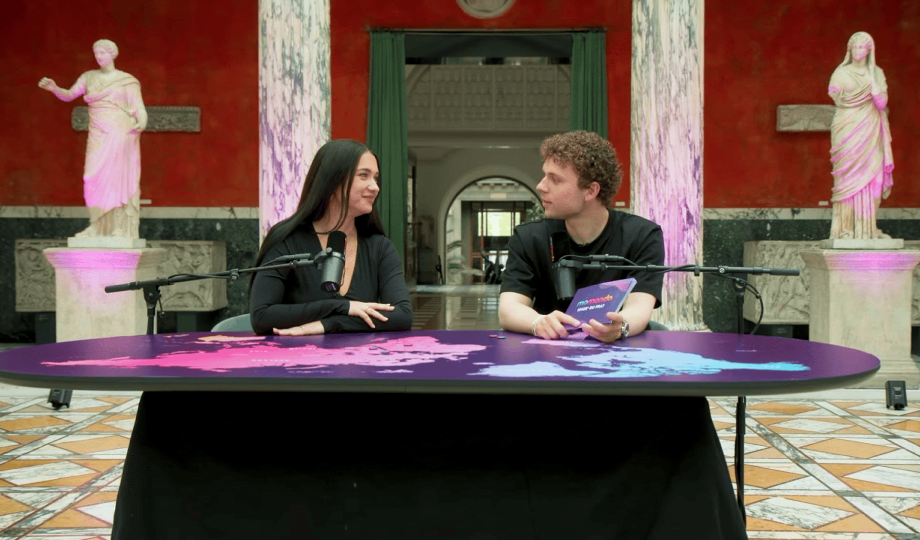
“Hvor’ du fra?” was developed into a full campaign identity by our in-house design team, using momondo’s brand as a foundation and organic forms inspired by DNA matches. I helped shape the visual direction across the campaign, working alongside designers, a copywriter, video editor and project manager.
My main responsibility was bringing that direction to life across some of the campaign’s key physical and digital touchpoints. I designed the world map and studio table, and owned the landing page from Figma through WordPress implementation and its later optimisation between campaign bursts.
Burst 1
~1,000
signups
~2% conversion rate
Burst 2
8,500+
signups
10.87% conversion rate
Observed performance after the competition became the primary hero content. The two bursts were not a controlled A/B test.
02 / DNA kit design
The first physical touchpoint.
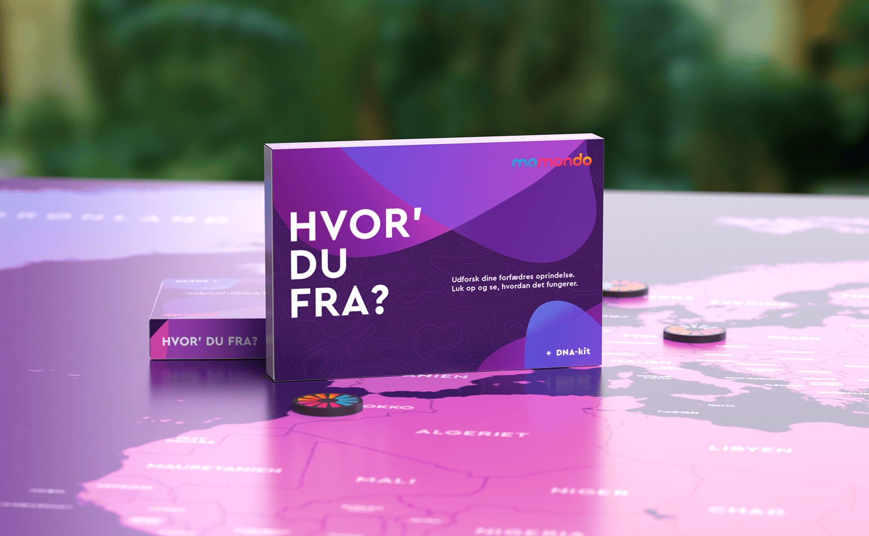
The DNA kit was a collaboration between another designer and me. As the first physical touchpoint, it needed to feel premium, personal and credible.
Using momondo's purple and magenta palette, we created overlapping organic shapes inspired by the coloured clusters found in ancestry maps. The result connected the brand identity directly to the experience of discovering where you are from.
03 / Map & set design
A visual anchor for every story.
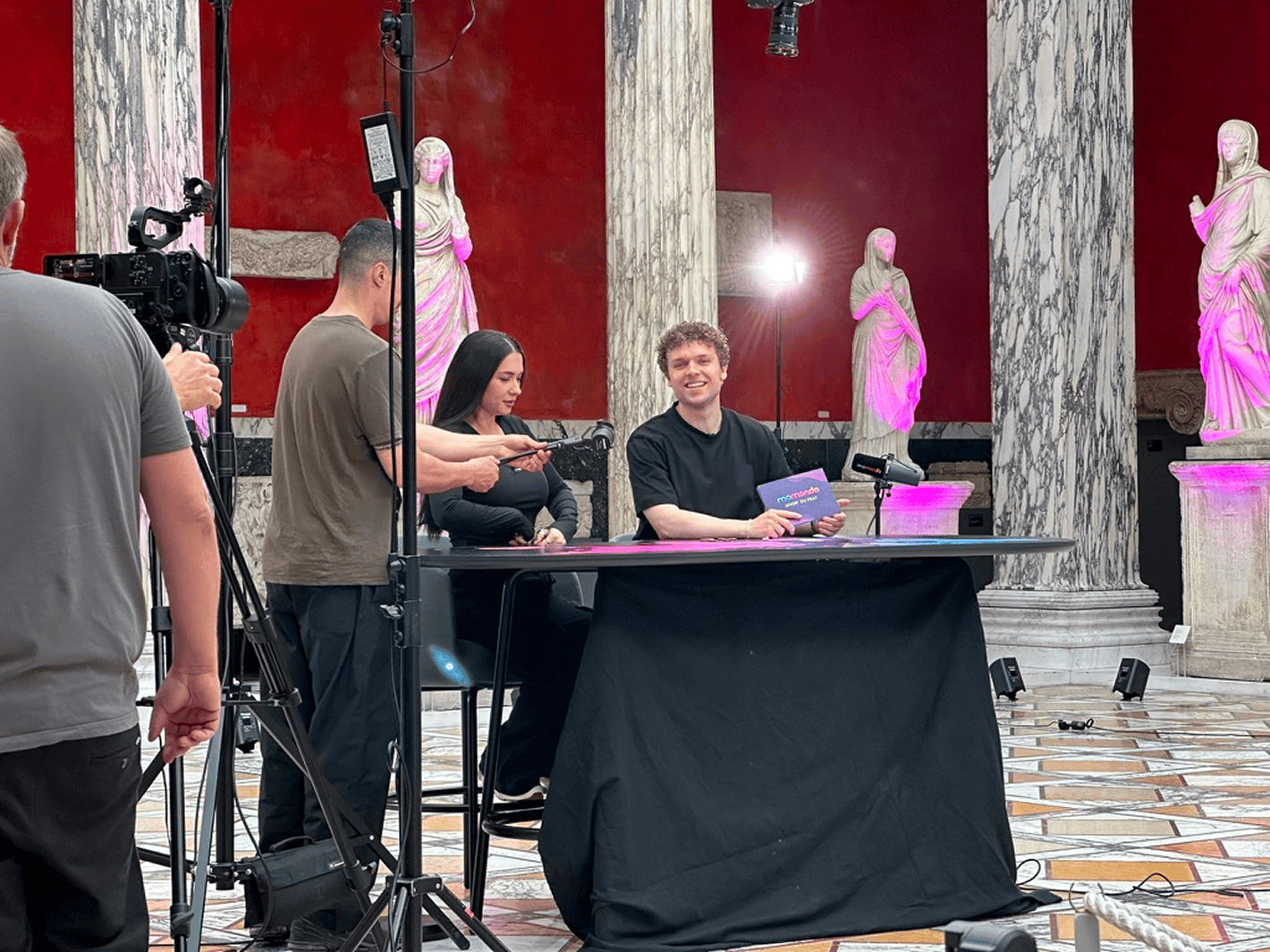
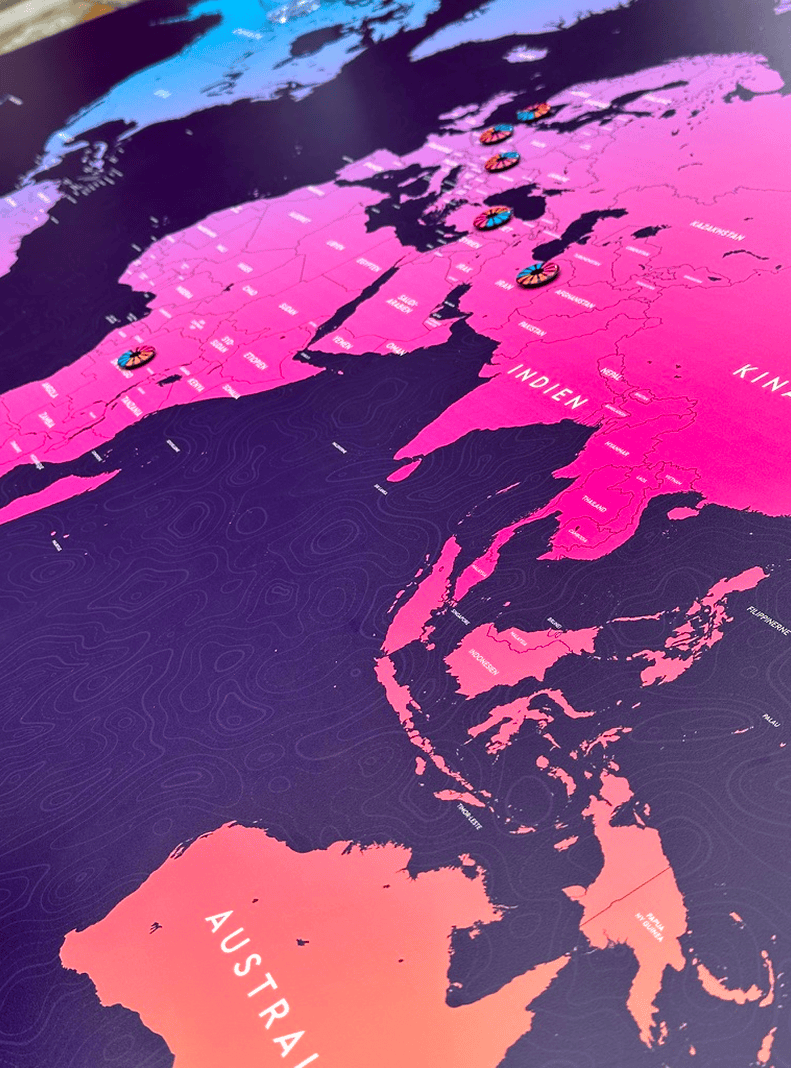
I designed the campaign world map as a visual anchor for the podcast and wider campaign. With a large number of repetitive country labels to produce, I used AI to help create an Illustrator script that automated part of the naming workflow, leaving more time for the design decisions that mattered.
Our first attempt simply printed the map for the studio table, but the material curled and creased and did not feel premium. I changed the production approach: the final map was printed on custom-cut plastic, creating a durable, polished surface that held up on set.
04 / Digital experience
From curiosity to action.
Working within an existing copy matrix, I designed the original mobile-first landing page in Figma and implemented it myself in WordPress. I owned how the campaign's episodes, guest stories and competition mechanic became a clear digital experience.
The page balanced editorial storytelling with a conversion path, extending the collaborative campaign identity into a responsive, usable system.
Subtle motion brought the overlapping coloured shapes to life. Their movement followed the direction and speed of the scroll, responding naturally as users moved through the page without becoming distracting.
View landing page05 / Results & learnings
Making the primary action impossible to miss.
The campaign landing page launched in two phases.
Phase one
I originally advocated for stronger competition visibility, but the first published version prioritised podcast and editorial content in the hero, with the competition further down the page. It produced roughly 1,000 signups at an approximately 2% conversion rate.
Phase two
For phase two, I again recommended making the competition the primary hero content. The direction was accepted, and I redesigned and implemented the new version. It subsequently produced 8,500+ signups at a 10.87% conversion rate.
The bursts also differed in variables beyond layout, so the result is a strong observed outcome—not a claim that the hierarchy change independently caused the increase.
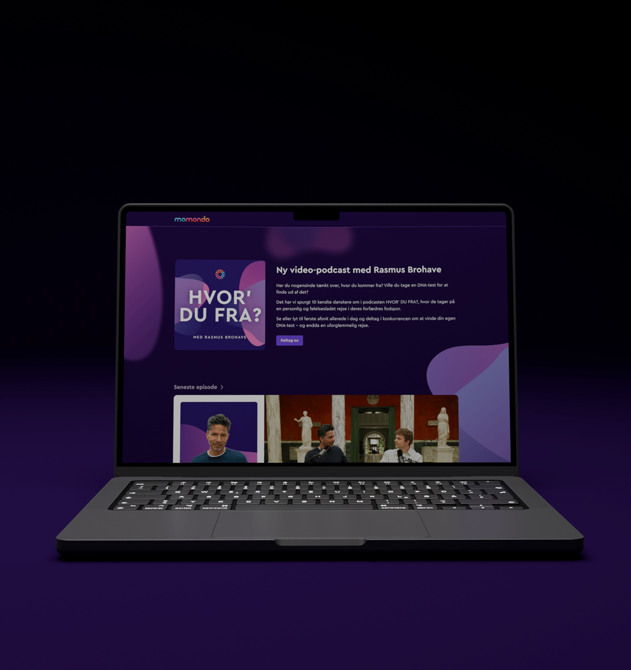 Phase 2Phase 1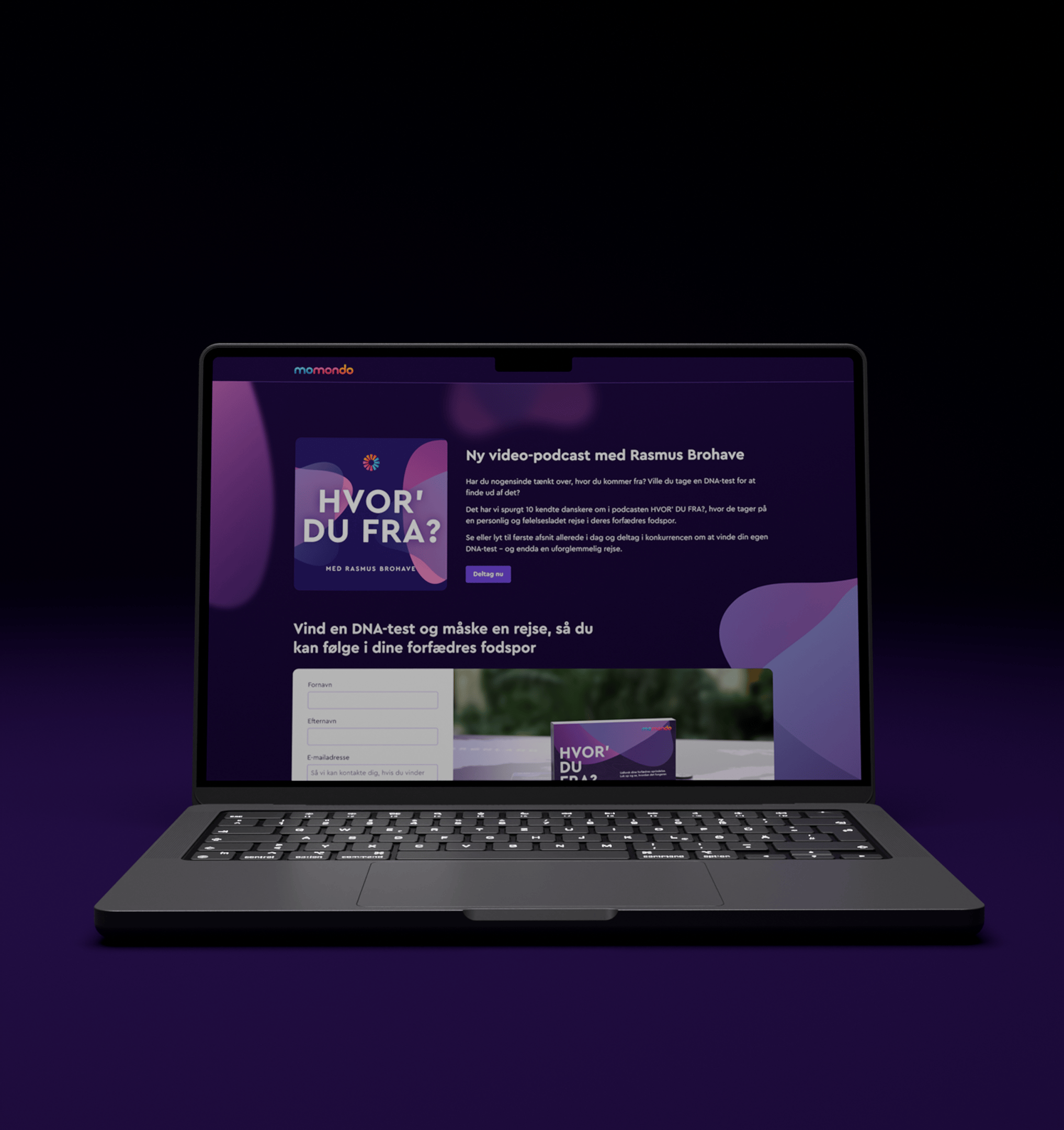
- Burst 2 signups
- Burst 2 conversion rate
- More signups vs. burst 1
- Relative CVR improvement